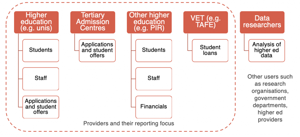
The Department of Education, Skills and Training was transforming the way in which higher education providers report back to government.
At the same time, the department needed to move off an obsolete web platform and reduce the volume of help calls.
Briarbird was commissioned to redesign the reporting website based on user needs and the requirements of the reporting processes.

This involved extensive research with higher education providers, which fed into collaborative design with the client and iterative UX and UI design. We also undertook continuous user testing and feedback.
Our research and design tested well with providers from all backgrounds. Our greatest achievement was to break down the complex processes into simpler chunks, enabling novice and expert users to quickly access what they need.
The outcome of our work was a detailed website specification, including goals, user and business needs, user journey maps, personas, user stories and requirements, a prototype, and online style guide.
Highlight: Iterative prototyping
The prototyping for this project started at the end of week one, when we had discovered the key drivers for the project and had come to an initial understanding of the needs of users. It continued throughout the project in tandem with user testing. Here are the key stages:
- Conceptual mock-ups in PowerPoint – we developed the first cut of the website specification after two weeks. This included conceptual mock-ups of key web pages. These mock-ups were tested with the client group.
- Wireframe mock-ups – we completed multiple iterations of wireframes using Sketch. The iterations gradually expanded as we identified key transactions and page types, and focused on desktop and mobile. We tested the wireframes to check they met the client’s needs, then went out broadly to representative users and tested multiple versions via ChalkMark (online wireframe testing service) and individually with users via Google hangouts.
- Hi-fidelity designs – we progressively worked on the visual design until we had a complete set of page designs. The designs were tested extensively with the client through design review workshops and with representative users through group presentations followed by individual testing via Google hangouts.
The website design was fully documented as part of the website specification.