The Digital Transformation Agency website started out as an interim site and minimum viable product. But over time, the agency grew and their needs and work changed.
Jonathan worked as content strategist in the team redeveloping dta.gov.au. (This blog was first published in March 2018 on dta.gov.au)
Through our discovery work, we learnt that 54% of visitors to the website were having problems finding what they wanted — so it was time for a revamp, especially to the menu and site structure which had outgrown its original design.
We conducted extensive user research and experimented with ways to make the findings come to life.
Doing some research
To improve the website, we firstly needed more information about people’s needs.
As the content strategist, I was responsible for the information architecture. In particular, I needed the user research to give me a clear understanding of users’ needs, goals and tasks.
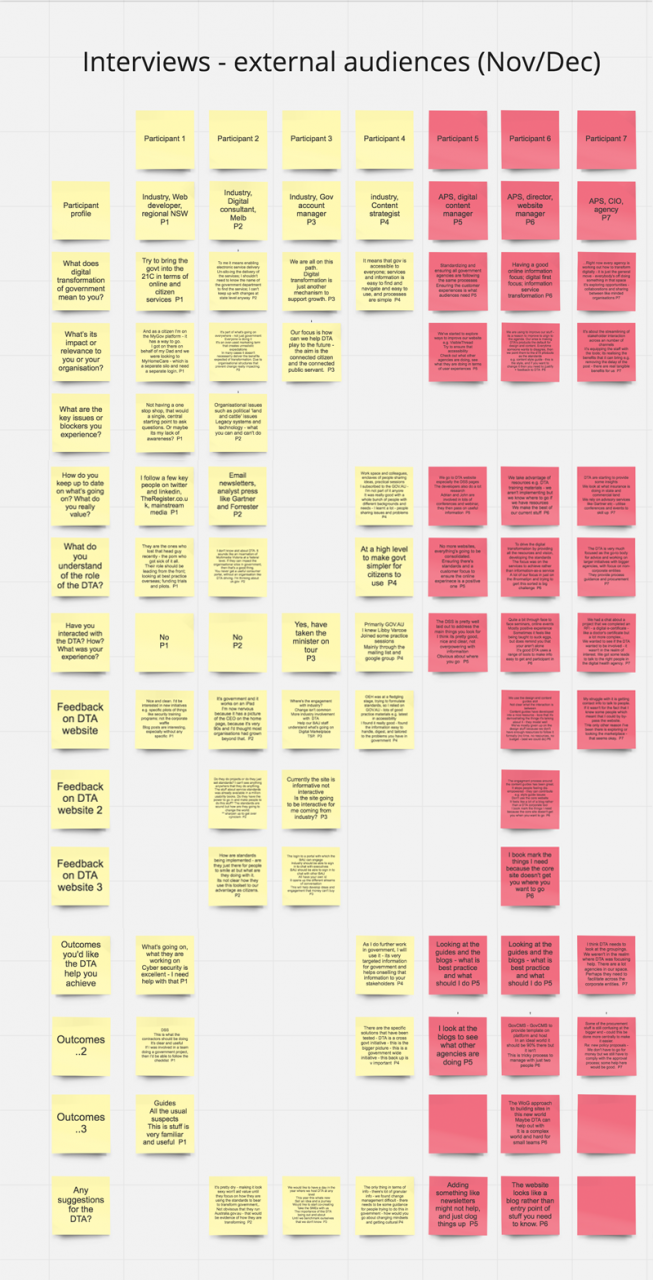
Our team conducted research with over 300 people. This included 20 interviews, 11 card sorting sessions, 5 tree tests on the site map, two surveys and usability testing.
IA testing using TreeJack
A great feature of this project were the multiple tree tests we ran on the site structure as it developed. A tree test helps you understand if people can find their way through the site structure. We used the online tool TreeJack to run these tests.
This approach allowed us to track how we were performing over time. We ran 5 tests over the course of the project. We tested quickly and often.
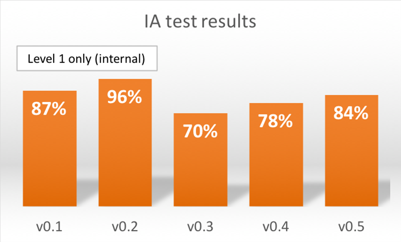
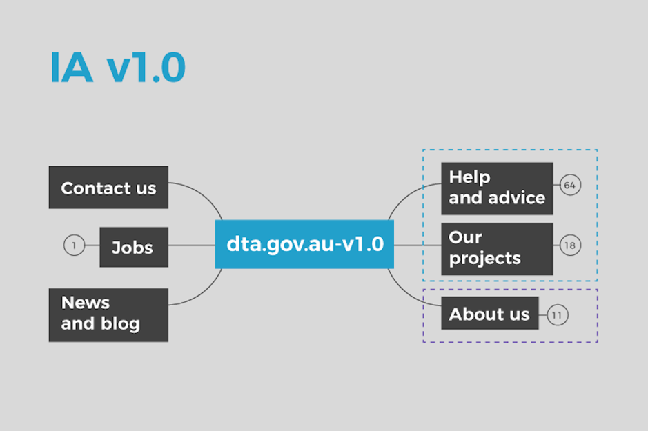
We ran the first test very early in the project, on version 0.1 of the new information architecture (IA). This version featured level 1 categories that we thought might be simpler and more effective.
We only ran the test internally because we wanted quick feedback. We also didn’t want to engage external users until we were more certain of the direction. We iterated based on those results to produce version 0.2. We tested internally again but with a different group of participants.
These early insights were fabulous. It gave us ideas about what resonated internally. It also gave me some ideas, as someone new to the organisation, about where the strategic priorities were and how the organisation viewed itself.
The next three tree tests we ran were all with external participants. In test 3 we introduced level 2 categories, and by test 5 we were testing the whole site structure. At each stage, we modified and refined the IA.
We used a fairly consistent set of tasks that reflected user and business priorities. Over the 5 tests, most of our changes to the site structure were successful. But we did have our share of failures. This forced us to rethink decisions and look closely at the data.
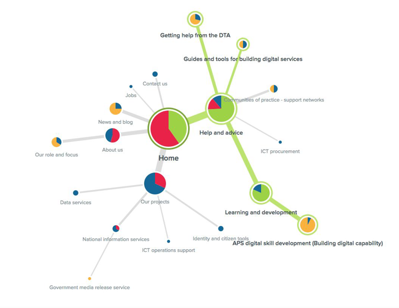
Caption: A diagram of user paths. This makes analysis much easier.
From the tree test we got a visual representation of user paths. It shows you where people are going and when they zigzag or trackback through the site structure, which is usually an indication of where they are having difficulty deciding on a path.
What we found through testing was that the site structure was more successful when there were fewer entry points. The DTA’s website is complex in terms of describing its services, projects and functions. The scope is broad and some of the material quite complex. Things didn’t always fall neatly into groups. What we found in the end was that providing few high-level choices — of level 1 navigation — led to stronger task success for users and stronger pathways for users.
Visualising research and findings
As we conducted interviews and tests, we picked up a large range of insights, quotes and comments from participants. Normally I’d document this raw data in spreadsheets and mindmaps. These tools are useful to me but weren’t useful in communicating within our team. Not least because our team was split between Canberra and Sydney.
So we got inspired to try something different. Another DTA project team showed us their approach to visualising their research and analysis. It looked very effective, so we thought we’d give it a go.
This approach involved using a cloud-based tool that provides virtual sticky notes and infinite wall space to arrange them on. The tool — RealTimeBoard — allowed our team members to view the research in multiple cities and make comments and edits.
Initially we used the tool to collate and present the raw data. This involved:
- creating a note for each user comment or insight
- adding a simple participant identifier (like P1, P2, D1, D2) so we could track back the comments to a participant and research session but keep it anonymous on the board
- grouping the notes by research question.
The result was that all our raw data was neatly set out. Team members could browse or search the data, and make comments.
Then we analysed the data, looking for common themes and insights. We did this by dragging the relevant notes from multiple participants into various groups. This process is called affinity mapping.
Putting it on the wall
Once we’d done this, at the top of each group we summarised the key outcomes or findings for that group of notes.
At one stage, our team was altogether in the same office. So we printed the findings out, stuck it on the wall and I presented back to the team. It was very successful because team members could browse the summaries, and then scan the relevant source participant insights that supported the summaries.
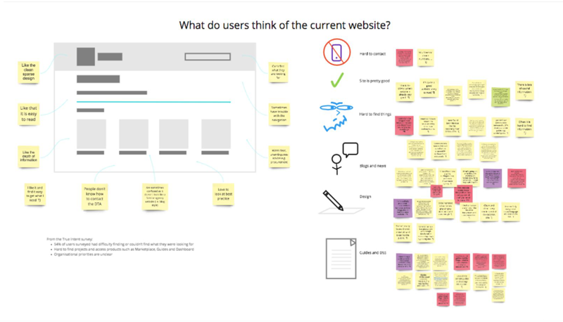
This was a dynamic way for the team to get across a large amount of detail. It was easy to see the breadth of the data we had and the types of comments, and people could judge for themselves if the summary or finding was reasonable. This made the research transparent, which was vital.
We continued this process throughout the project. This meant we had a visual story map of the project covering all the key points such as who the users were, what outcomes they were seeking, what their key tasks were, and so on.
This formed a narrative around the project and the supporting research. It was a powerful way of communicating within the team and to others outside the team. It was more engaging than a slide deck or document, because it allowed the reader to validate for themselves that the findings are valid based on the evidence — in this way the team collectively owned the research and findings.
Turning the research into features
Our user research was the backbone of our website redevelopment project. We were able to progress because we had an ongoing cycle of research, design, test. When we had difficulties or setbacks, we went back to the research to validate our assumptions and look for insights.
Visualising our research and findings helped us own the findings as a team. It also allowed us to effectively communicate with other stakeholders.